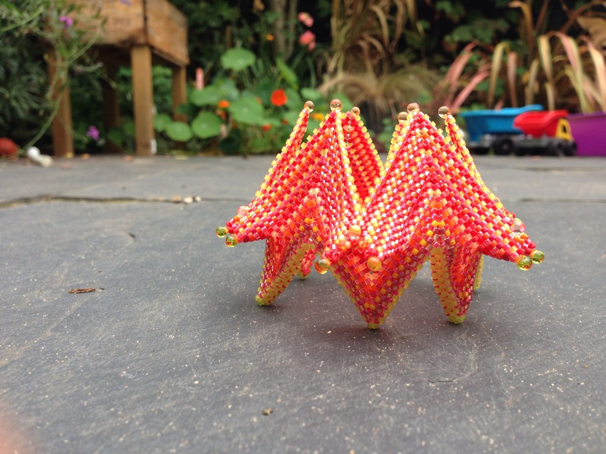
I’ve had my electronic copy of Contemporary Geometric Beadwork 2 for a few weeks now, and with the bigger boy at school at last I felt I had the time and energy to have a go at another piece. One of the loveliest pieces in book 1 was the Fortuneteller, and with lots of lovely examples in book 2 I felt inspired. It’s gone together very nicely (they really are deceptively simple designs in the end) and I’m really rather pleased with it.
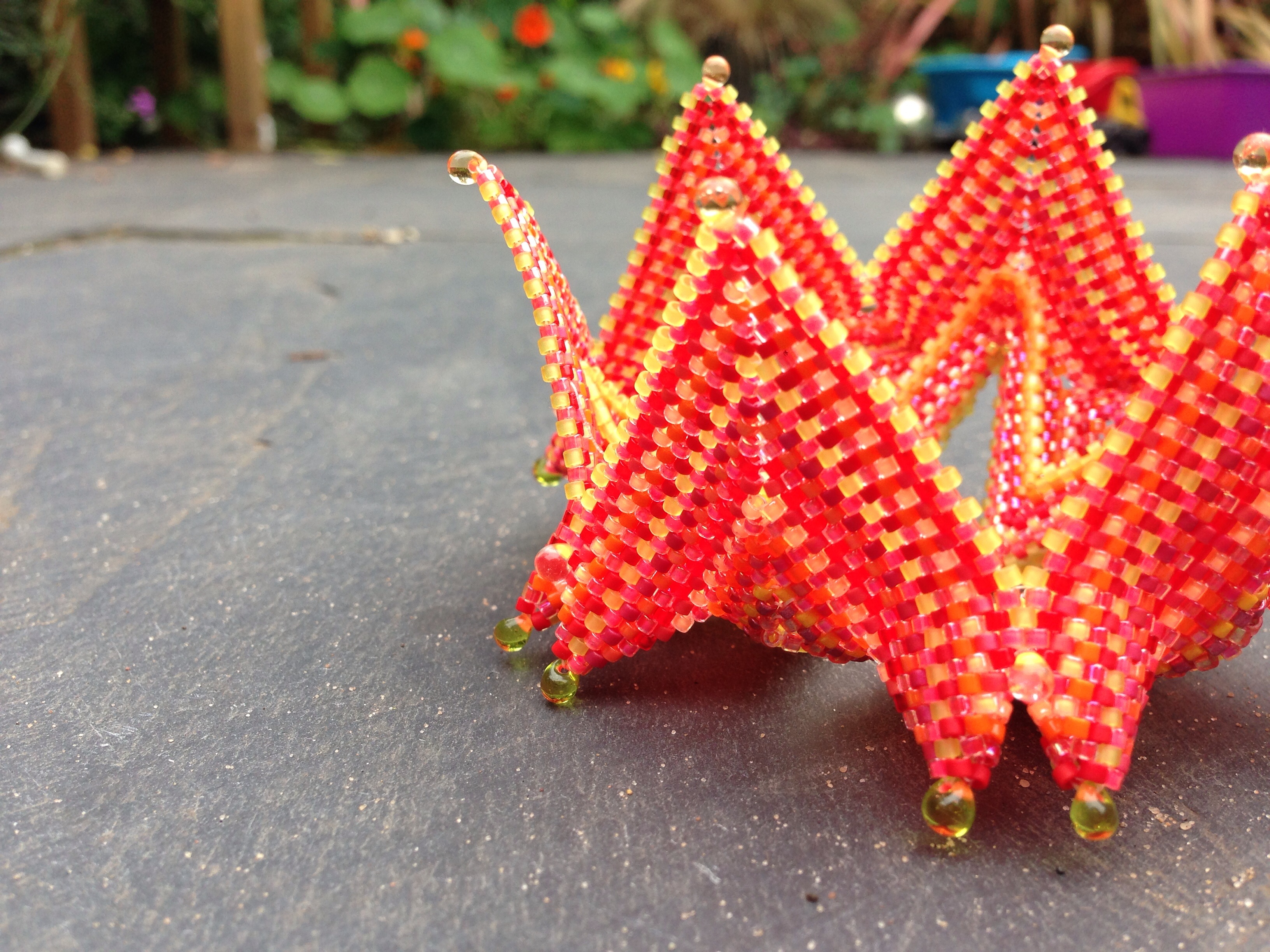
I used a variety of shades of red, orange, salmon and peach delicas, including two of the newish luminous colours. In natural light the finished piece is very bright, but the yellow tones of artificial light do quieten it a bit. Apologies for the failure to take photos in progress, but I don’t get much chance to get at my beads in daylight……
Recipe
29g of delicas in around 15 different shades of salmon, red, orange, peach, yellow and pink, including luminous, mattes, metallics and transparents. 24 Miyuki drops (various colours, taken from a mix).

Tips & variations
I made their ‘small’ which is only just large enough. However I do expect it to stretch a bit in wear so I’d say this should be perfect. Their small is six repeats of the zigged band with 10 units on each side of the zig. My knuckles measure 21cm round.
I had a little trouble following the instructions towards the end so I ended up simply adding a drop to what I felt was roughly the right place, and zipping 3 beads only Jean Power style, which gave about the same look, avoided making it any smaller and seems fine to me.
Next time I will vary slightly and add drops to the modified raw band (at the decreases) to match the other points.
I didn’t add drops in the final round (after zipping) as I felt the three already there were sufficient.
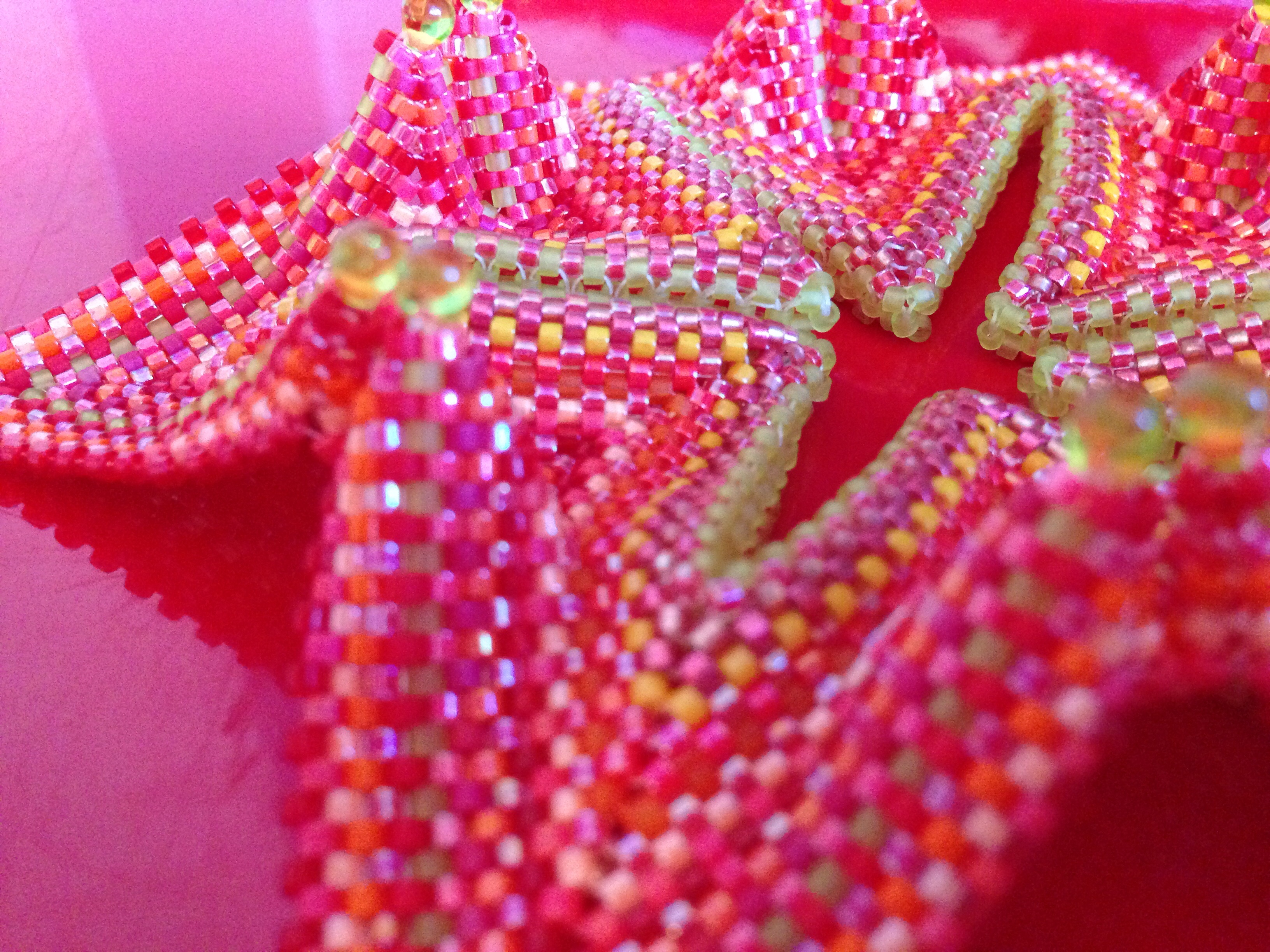
I used some transparent frosted lime beads for the raw band and edges. If I was making again I think an opaque bead would work better here (although I would still use transparent beads for some rows in the main fabric), or even a metallic. Alternatively I might use two colours in the RAW – one for the horizontal, one for the vertical beads, as that would more closely mirror my colour use in the rest of the piece and allow the band to blend more.

What next?
Another one I think, in more subtle colours (probably soft grey metallics and blues). I am also wondering what this would look like in seed beads?

One thought on “Telling fortunes”