Sparkly mistakes

Before Christmas I beaded another project from Beadwork Evolution – ‘Stars We Are’ earrings. I wore them a couple of times (sadly dangly earrings don’t get worn much when there is a toddler in the house), but it was only when I laid them out to photograph them at the weekend that I realised I’d messed up!

DSC_0737

Have you spotted it? To give you a clue it’s my old problem with hexagons versus pentagons…….

So I am pleased to report that this design can be adapted to form a five sided star at the base rather than six. Ideally though one should adapt both earrings, not just one!

DSC_0252

Recipe

  • Sabine Lippert’s Bead Evolution p102
  • Swarovski 3mm bicones in Light Siam; Fuchsia AB, Fuschia & Violet, Bonarski Bicones in Purple Metallic & Blue Metallic
  • Miyuki size 15 seeds in Black AB matte 401FR

DSC_0246

Tips

  • Sabine uses two colours of crystals.  I couldn’t choose just two, so I used six and ran from red with a contrasting centre of metallic blue, through pink to purple.  I like hers, and I like mine too.
  • Pay attention – the way the stars are joined and constructed is very elegant in it’s simplicity, but it took a few repeats to get the hang of it as it is not obvious.  And clearly check how many repeats you have put in each unit……..

Verdict

Really lovely, nice to make and fabulous to wear.  It took under an hour per earring, probably less for a second go, so I’m definitely going to make again in some other colours.  I’ve got some lovely opaque bicones which might make a less blingy version for the daytime as well.


Bubblelicious

When I started this blog I made a few rules for myself.  One of them was to try to use photos taken on my phone, so that I was just capturing the work I’d done without having to set up for ‘proper’ photography.  In my shops  all the photos have been taken ‘properly’ as I think it’s important for customers to get the best possible reproduction of what they are buying, and I want to be able to show levels of detail only possible with a macro lens.  When I take the ‘proper’ photos I use our digital SLR, macro lens and big sheets of white or black mounting board propped up in our front room window – the translucent window film which stops the neighbours seeing the mess inside gives a lovely diffuse natural light.  For the blog I want more spontaneity, and definitely don’t want to wait weeks for that elusive couple of hours with no little people.  When I take photos for the blog or Facebook it’s usually with my iPhone, against whatever plain background I can find and with the closest to natural light I can get – I’m after speed rather than fabulous quality, but so far I’ve been really impressed with the photos I’ve taken.  Last year I particularly enjoyed being able to shoot my Fortuneteller on the lovely slate tiles in our back garden,  with nasturtiums behind. However, in the depths of winter, I’ve really struggled – so although I finished my Bubble Ball before the New Year, I’ve only now had the time to get the big camera out and take some pictures for you.

DSC_0231

The Bubble is another piece from Sabine Lippert’s new book ‘Beadwork Evolution’ and it was the piece I wanted to make the most when the book arrived.  I only had the twelve chatons required in a couple of colours, and although I thought I had lots of drops, only one set matched, so I’ve ended up with a combination which makes the finished ball look quite different to Sabine’s.  Black, though versatile isn’t a favourite colour for beading, and it is tricky to photograph.  That said, I still love it, and the drops I used are just stunning and I think they really make the piece even though it’s not as bubbly as Sabine’s.

Recipe

  • Sabine Lippert’s Beadwork Evolution – page 133
  • Chatons & Bicones – Swarovski Fuchsia
  • Drops – Hybrid Jet Sliperit – from Beads of Bohemia via Etsy
  • Seeds – Black Miyuki
  • Fire polished – Black Czech

DSC_0750

Tips & Lessons learnt

  • Watch your tension – as usual with Sabine’s stuff you need to stay nice and loose.  Which is the opposite of my normal tension……….
  • It does turn into a bit of a needle bender towards the end so be prepared with a good light and some tweezers.  And perhaps don’t use your very best needles?
  • I kept forgetting to do step 4 again and again. Don’t do that.
  • Whilst the sliperit drops are incredible, I paired them with black beads as that seemed best.  And I normally avoid black beads like the plague – they hurt your eyes and a pig to photograph.  They also mean that a lot of the detail of the construction is lost and I think that’s a shame.
  • Because I couldn’t tell how much the Fire Polished beads in the core would be seen I opted for black there as well, and although the finished piece is very wearable it might pop a bit better with some contrast – perhaps a copper core or even perhaps a black core with copper seeds?
  • Sabine again matches the chaton and crystal colours – I think that works really well, but would like to see what happens to the shapes with an alternative (particularly if I used a lighter chaton colour than the crystals).
  • It took me about four hours to finish (including a lot of colour faffing) – I’d expect to be quicker next time, so would fit into a few evenings nicely.
  • For my next version Stitch N Craft have some of the drops in Crystal Sliperit, and as I also have some Piggy Beads in the same colour waiting to be used I think I might get some for another version, as the crystal will be more ‘bubbly’.  Not sure what colour chaton to use with them though, so can’t quite work through all the beads needed…….
  • Or I ought to really try it with the translucent drops Sabine used – I’ve done an order since I made this so I have some more ‘bubbly’ ones in my stash now.
  • Either way this seems to be very much like a design I’ll make lots of versions of, so you’ll be seeing it again soon!

DSC_0754

Materials Packs for Baroque Tape Measure Surround

Just a quick post to let you all know that I’ve put together some materials packs for the Baroque Tape Measure Surround.  Two colourways which I’ve beaded up previously, including the original Bronze & Fuchsia, plus two completely new colourways never yet made, so they will be completely unique.  They are available here on Folksy (Bronze & Fuchsia; Bronze & Capri Blue; Silver, Red & Turquoise, Gold & Scarlet) and here on Etsy.  For choice I’d love it if you used Folksy as they are very nice and I’m really, really upset with Etsy about their behaviour to sellers around the whole EU VAT thing…… more about that another day.

Baroque Tape Measure Surround 2

Now I’ve got a good stock of tape measures and those elusive 2.8mm drops I’m more than happy to put together custom materials packs for you – just drop me a message/comment with a colourway request and I’ll have a beady play.

DSC_0691DSC_0666DSC_0685DSC_0683

Although these are listed for UK sales only, I’m happy to discuss and set up overseas postage – be aware that now I’m back at work I can’t get to the Post Office as easily for overseas posting (for UK posting I’ve carefully planned these as letter post size to avoid that trip), but if we have a chat I can let you know what to expect.

Tiles on a Ring Pendant

Well the book arrived two days ago and I got stuck straight in. Luckily I have a good stock of chatons, because this book is going to munch them up. For choice I would have made the Bubble Ball Pendant first because it’s my favourite, but I had the right beads for Tiles on a Ring so I dived in. It went together beautifully – Sabine’s designs are always so simple, whilst looking amazingly flamboyant. Around three hours in total, so an excellent weekend project.  It uses a RAW base with a 3D netted embellishment to form the cups and frames for the chatons, and I’d say it’s suitable for intermediates.

IMG_2256.JPG

Recipe

Sabine Lippert’s Beadwork Evolution p99
Seeds in 401FR Matte Black AB 11 and 15
Matte purple iris fire polished
Fuschia Swarovski bicones and chatons

IMG_2253.JPG

Tips
I got the colours wrong – the fire polished beads are too different in colours from the seeds, and because the seeds and the firepolisheds are next to each other rather than used together it makes the firepolished ring look a bit disconnected. A shiny finish might have worked, or blue iris to match the seeds. This is a shame as I’d chosen the combination to go with the Baroque Dimensional Bracelet I made a while back.

Use the same colour of bicones and chatons – that will give you lovely squares of bling, and you’ll loose those squares if you don’t match them.

As with all of Sabine’s pieces a relaxed tension really helps – I have to make the effort to remember this one!


Beadwork Evolution – Sabine Lippert

At last it has arrived after a frustrating wait …….. And it’s fab! Some very Sabine stuff, and some slightly different stuff so a good mix.  Cue a happy evening looking through my stash and choosing what to make first (interspersed with sulks when I don’t quite have the right beads). One of the 3d balls from the last chapter probably, if I have enough chatons. Watch this space.

Glue

I’m scared of glue – in beadwork it always seems to let me down. I know that just as when a wholly stitched piece fails it’s my technique that is at fault, but I still avoid it rather than learning how to use it correctly. However, I spotted some interesting clasps on Etsy which solve the age old problem of how to finish a flat beaded cuff without interrupting the simplicity of the shape, and the only way to attach my flat beadwork to them was to get out the glue. So far it has held………

IMG_2203.JPG

Recipe
34g peanut beads in silver lined frosted crystal (Stitch N Craft)
1g size 11 seed beads in silver lined frosted crystal
Magnetic box clasp
Thread of your choice
Glue/cement of your choice

Method
This bracelet is based on lots of pieces I’ve seen around the beading world using plain RAW and farfalles/peanut beads, so although its simplicity (flat RAW – not exactly revolutionary) means I did strictly speaking manage to design it myself, the credit for the concept belongs to others – so if you want a proper pattern head over to Etsy and look at Shelley Nybajke‘s splendid downloads using some bigger lovely etched beads. I bet she isn’t scared of glue.  Aurelio Castano has also done some lovely things with similar clasps, and Beading Daily blogged about both of  their work (which is what made me order the clasps in the first place).

Anyway, it consists of 43 rows of RAW 10 units wide using the farfalles.  Then to create a tab to glue into the clasp I sized down using 11s and then did a row or two using pairs of 15s (have a play to see what will fit into your clasp).

image

Tips
Use a double length of thread – work with one half, then go back and build out in the opposite direction using the other half.
Fasten off and attach a new thread for the 11s as then if something goes wrong with the catch you won’t trash the main part of the beadwork.
Next time I’d make this wider rather than narrower than the catch – I just think it will look better.  One or possibly two more units per row.
I’d also make it a touch snugger on the wrist as it will sit better and not flap around. Two or possibly three rows less (I have a 16 cm wrist – finished length was 19.5cm and  I think 18cm would have been better).

These clasps were fine to play with, but if you have another source locally I’d go for something a little more expensive as the plating has already started to wear a little.  Also the holes on this colour (which looked like they might be useful for glue avoidance) turned out to be a bit clogged up with plating and would have trashed my thread…….

Chromomania (part 2)

And so to Bath for a belated birthday mini break sans enfants. Main reason (other than loveliness of Queensberry Hotel and Bath in general) was of course the Kaffe Fassett exhibition up at the American Museum, and it was as expected completely fab. I particularly loved the use of giant blown up photos of his work on some kind of vinyl as flooring, which coupled with his work and the intense wall colours made it a very immersive experience.   It is so difficult to describe his use of colour in particular adequately to those who haven’t seen his work, so here is a link to a video about the exhibition on the American Museum site and some of my snaps instead so you can experience some more chromomania.  Apologies for quality of photography, my iPhone seems to find his exuberant use of reds in particularly quite hard work.  Wimp.

My quilting mother and I have both loved and been heavily influenced by Kaffe’s work since he came to prominence in my teens,  and although beading has largely replaced patchwork, tapestry and knitting for me, I still find him incredibly inspiring.  As well as two huge Persian Poppies shawls I knitted at Uni, posters, insane cardis, scarves and hats using his wools for Rowan, and various other pieces designed by him including a divine lobster needlepont, Mum’s vivid patchwork pieces scattered round the house are a daily reminder of his influence on us.  So the exhibition has wound me up nicely, and on my return home the colours will be out in force for both textiles and beading …….. I’m wondering if I can do a Jean Power faux cro rope tribute to some of his early knitting designs, and how about something ridiculous with those neon pink spikes that have just arrived?

Whilst in Bath my tolerant husband also allowed me to amble round the Fashion Museum which was as always fascinating, and we had some stunning food – very interesting tasting menu and wines at the Olive Tree (below the hotel), Sushi at our old favourite Yen Sushi (behind the Assembly Rooms) and a wonderful fishy experience at Blunos.  Yummy.

Chromomania

Boy 2 and I popped up to Tate Britain yesterday to look at the incredible Late Turner exhibition. The paintings and sketches were as ever extraordinary, and in one room my eye was caught by a description which talked about criticism of Turner’s apparent ‘chromomania’. As I stood surrounded by glorious paintings I almost laughed – what was a narrow minded criticism then seems like a huge compliment now. If you are in London, go see, and rejoice in the exquisite use of colour. And if you do go, pop along to see the earlier Turners and enjoy Olafur Eliasson’s fascinating colour studies – very interesting. I will of course be using ‘chromomania’ as my new beading watchword………

And another one……

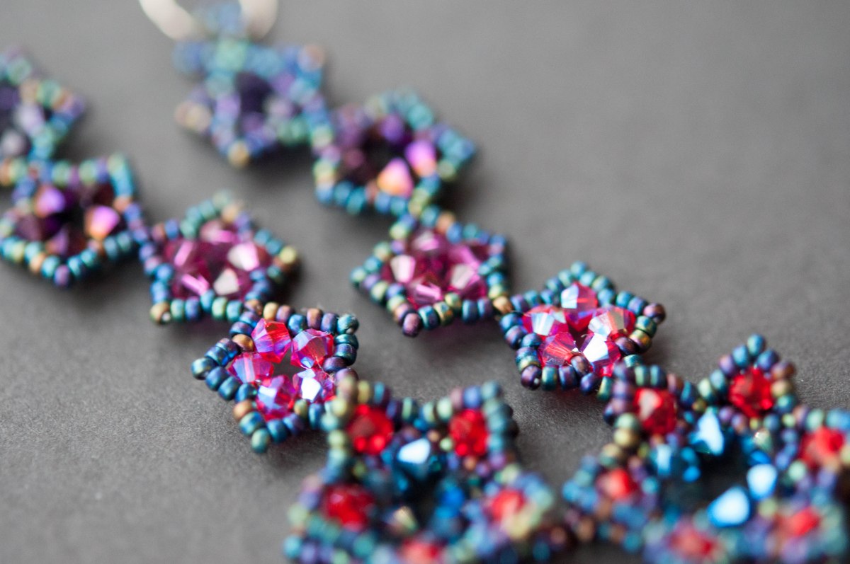
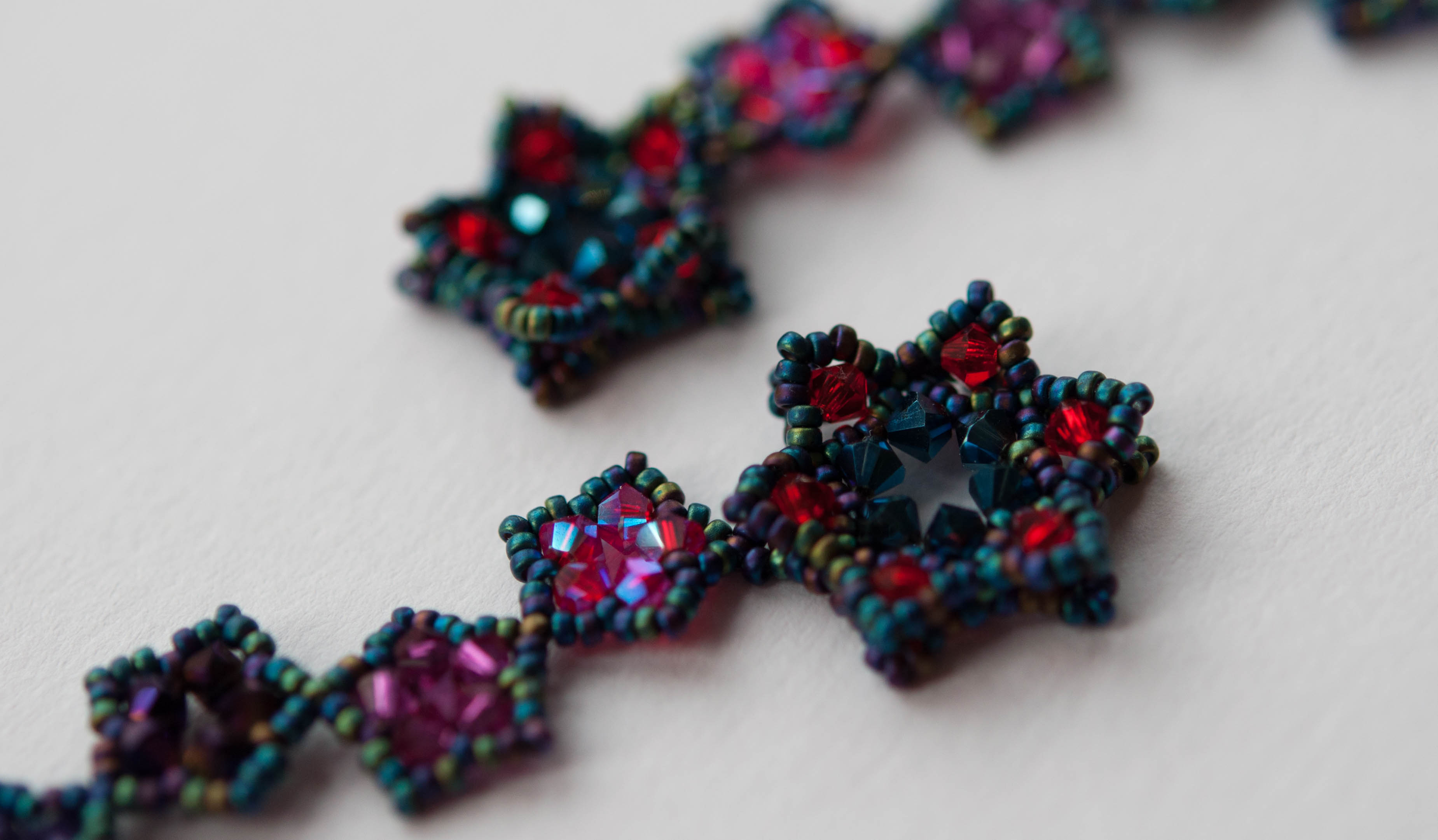
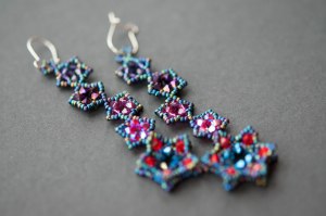
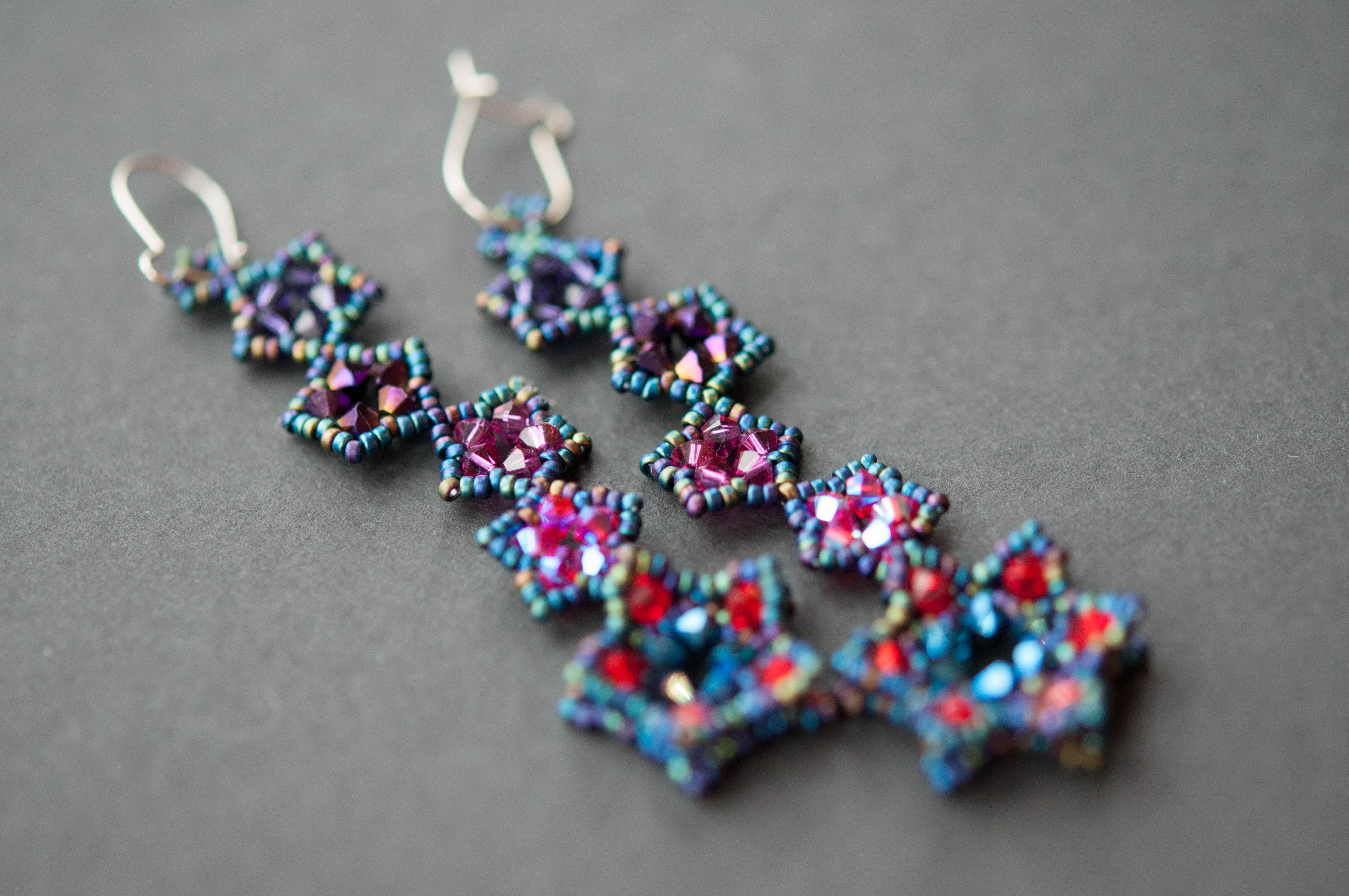
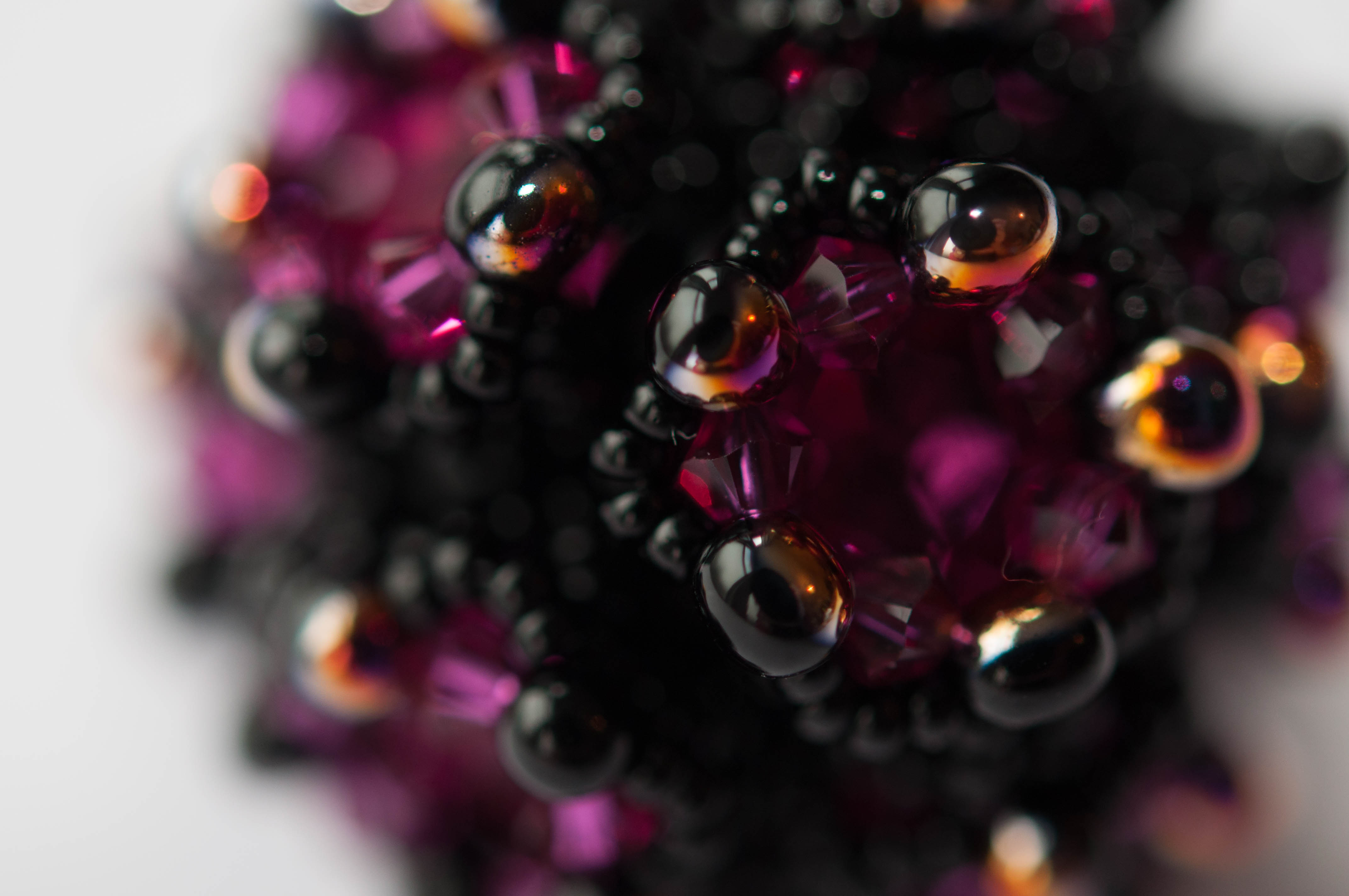
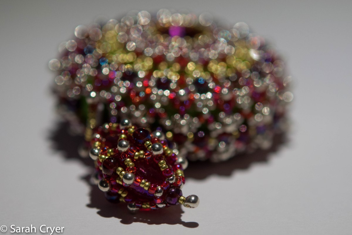
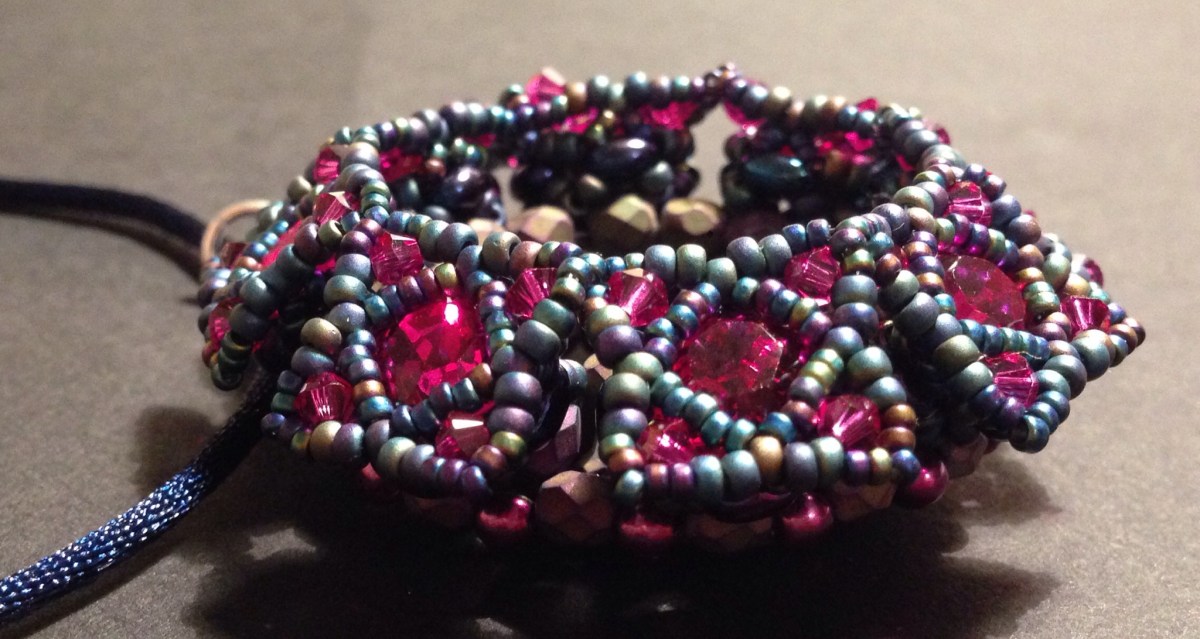
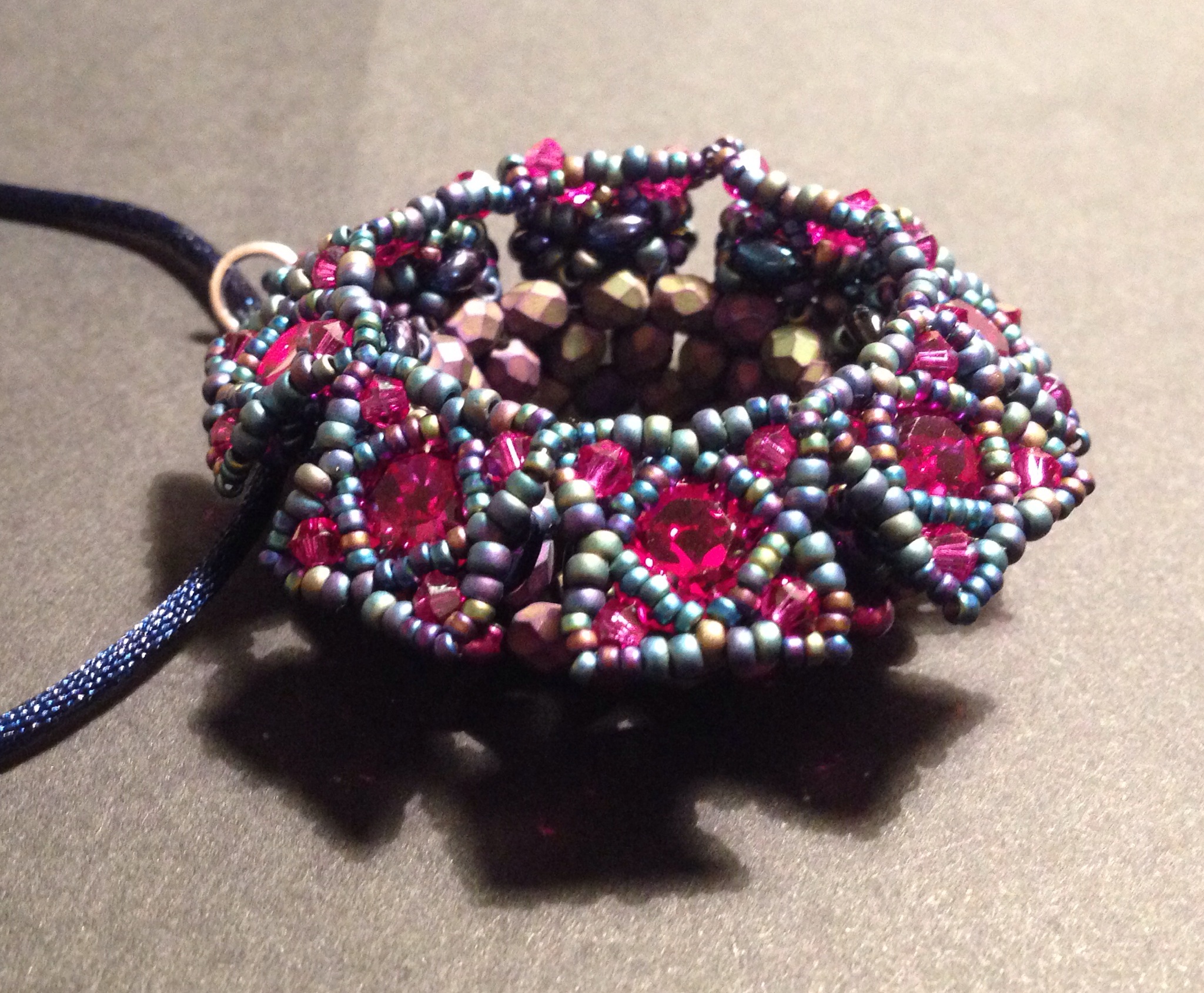
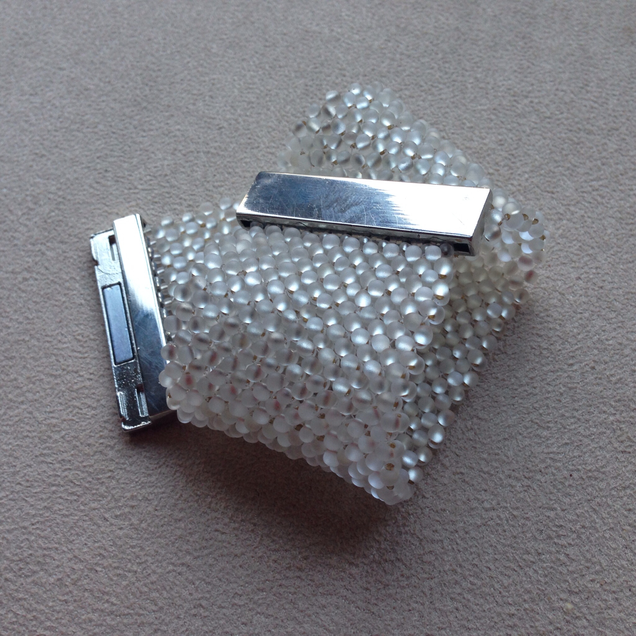
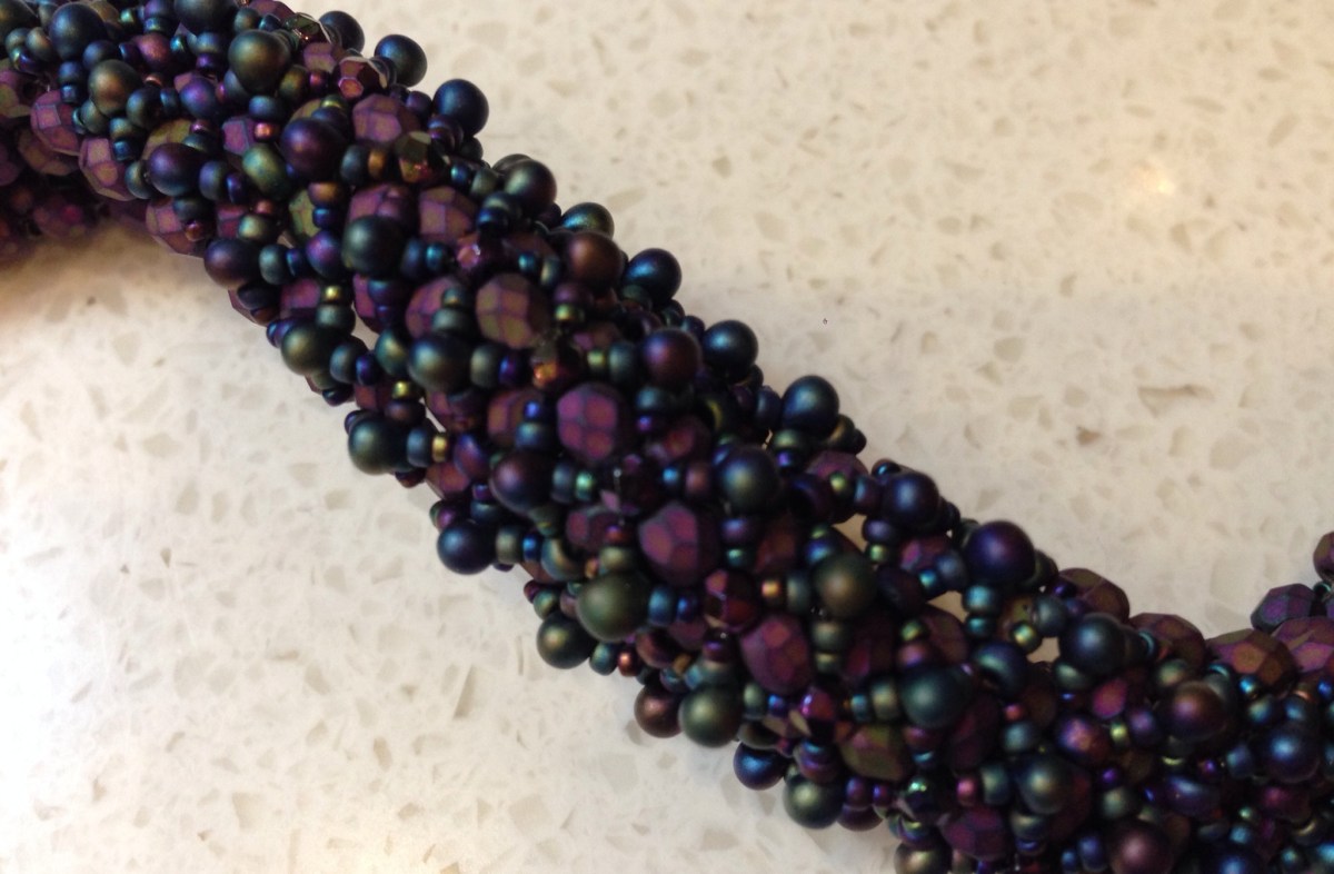
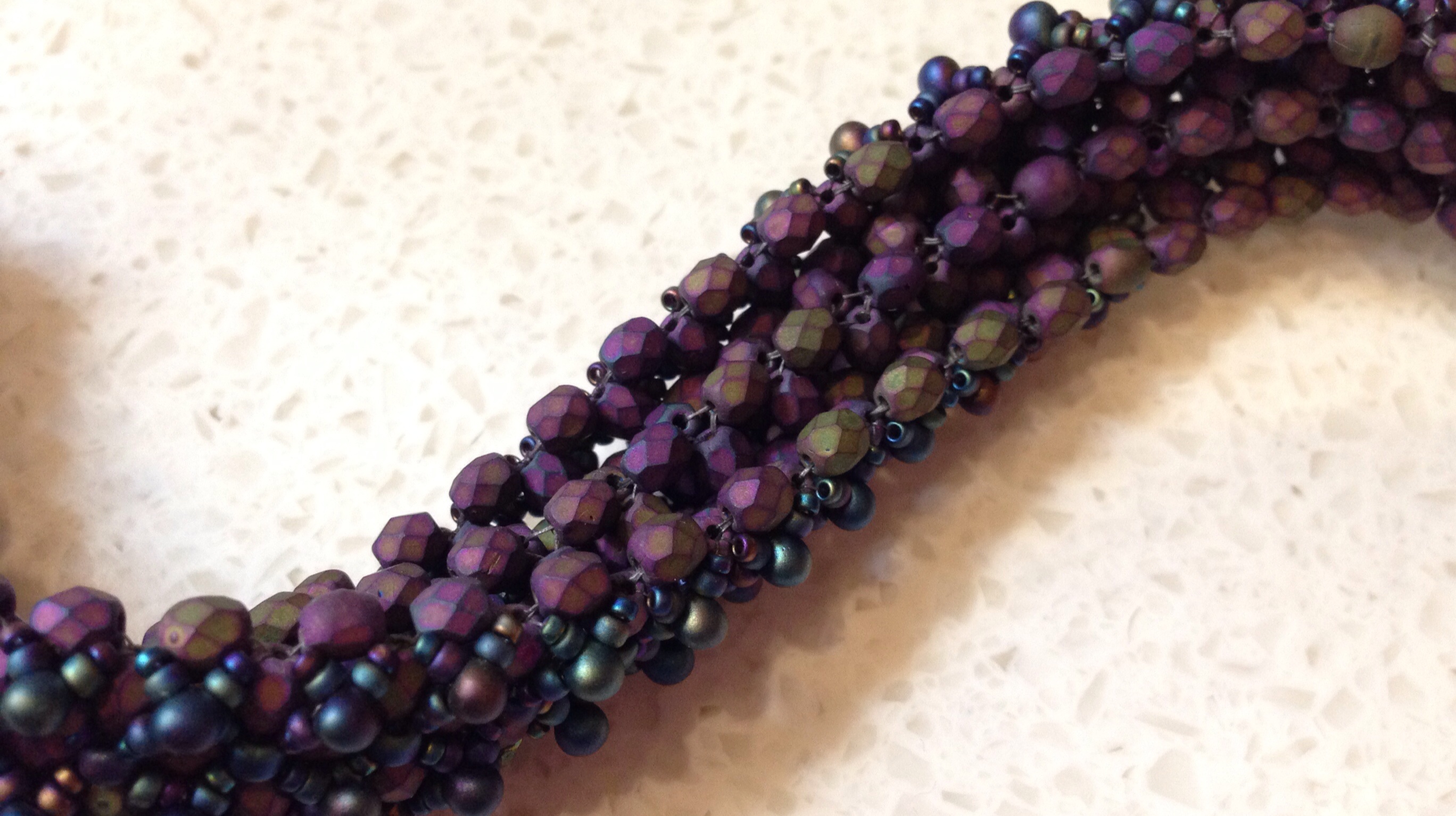
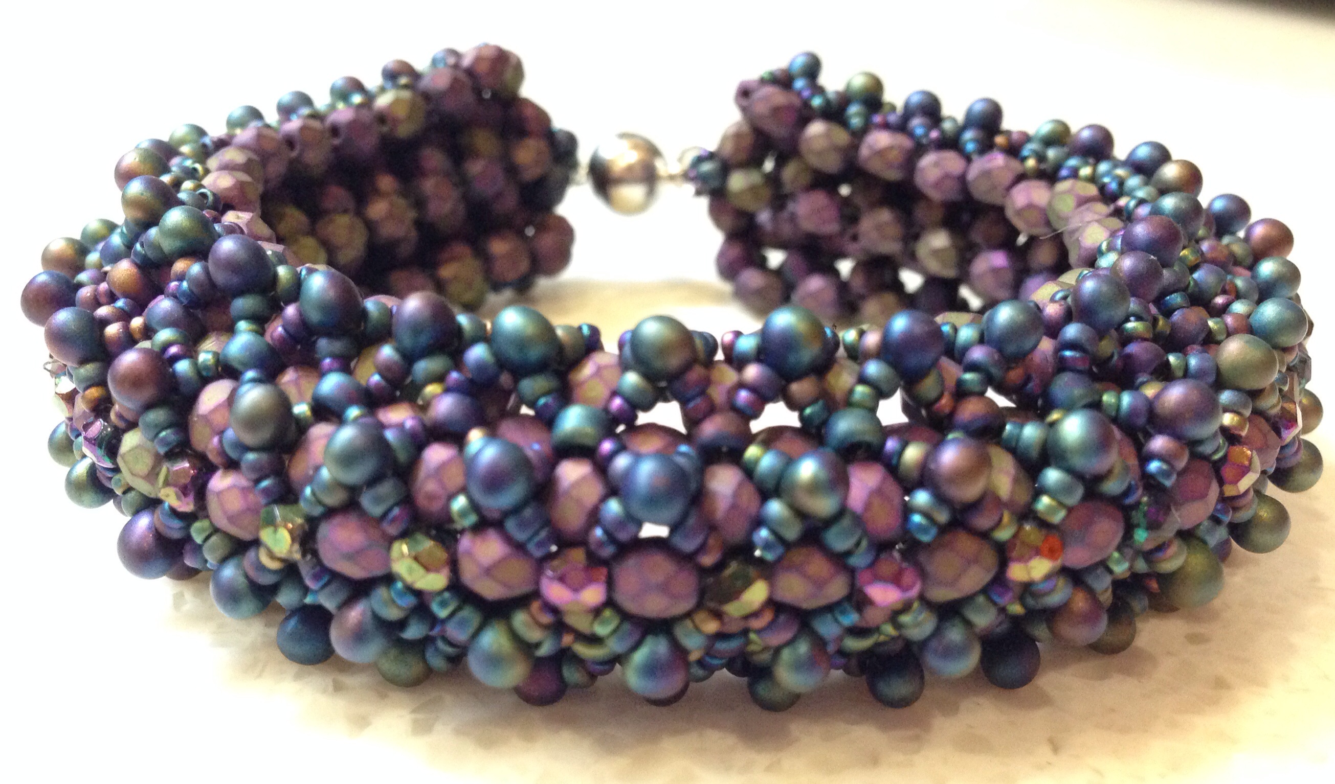
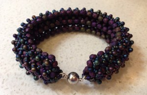
Since I had the pliers out yesterday I finally got round to adding a clasp to a Sabine Lippert piece I finished beading a while back.  It’s a Baroque Dimensional Bracelet and  instructions are available for download from her website, and the simplicity and repetition made it a really lovely piece to make – but of course as with all Sabine’s pieces it looks absolutely amazing.  It curves beautifully – both around the wrist and across the width of the piece, making it seem lovely and fat and chunky.  Very pleased with this one.

image

Recipe

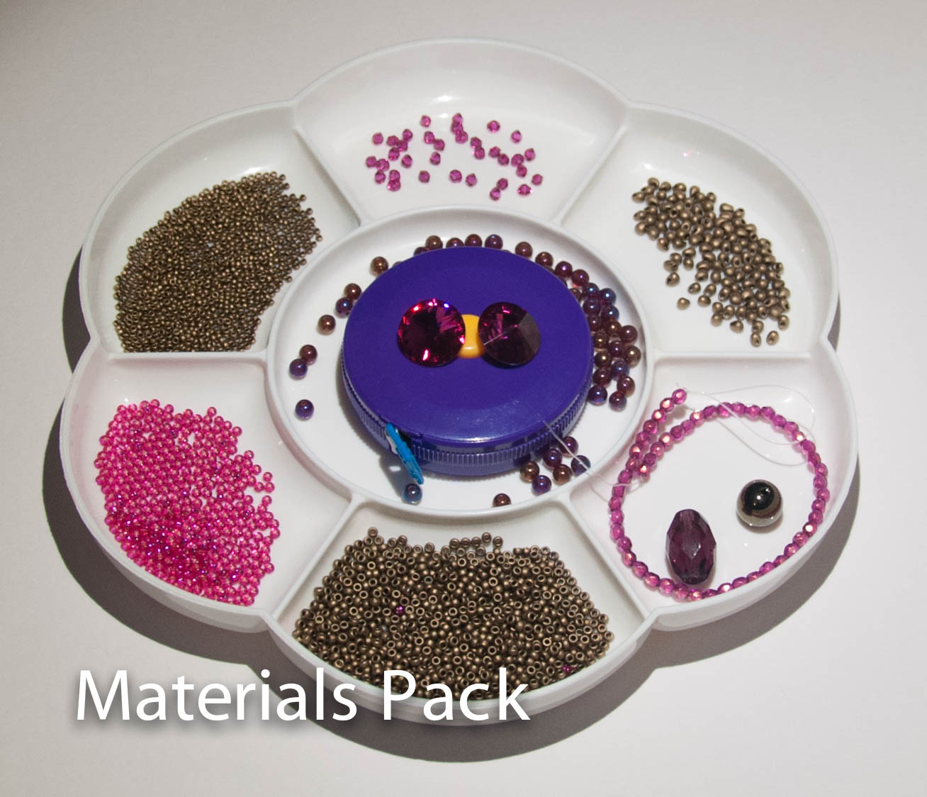
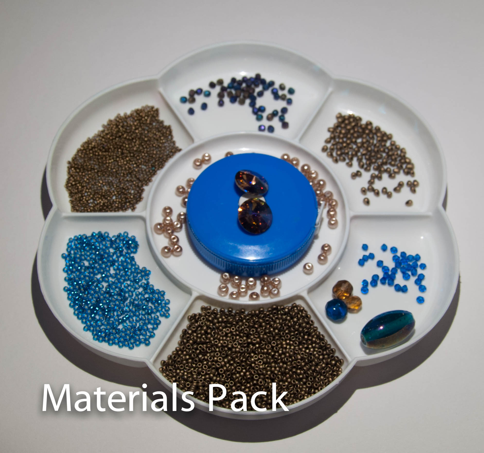
Fire polished beads 4mm  Matte purple iris (from Etsy More Beads4U)

Fire polished beads 3mm Purple iris (from Robins Beads)

3.4mm drop beads Miyuki 401FR Black Matte AB (from Stitch N Craft)

Size 11 & Size 15 seed beads Miyuki 401FR Black Matte AB (from Stitch N Craft)

Fireline 6lb

Silver magnetic clasp, jump rings.

The Miyuki Black Matte AB are a current favourite as they are a kind of navy blue base, and I’ve not been able to find another good match for navy.  For some reason I am wearing a lot of navy at the moment and it is certainly easier to work with than straight black.

image

Tips

  • I did 30 repeats as per the instructions, and it fits very nicely.  The finished beadwork measures 20cm (without the clasps) although do bear in mind I am quite a tense beader.
  • On that note, relax, relax, relax your tension, particularly for the base layer.  For me that means beading in a way which felt baggy, floppy and downright messy, but you need plenty of give in order to add the embellishing layers.  This is common with embellished RAW pieces.
  • Otherwise as usual Sabine tells you everything you need to know……..

Next steps

Another good relaxing project, like the Faux Cro, I’m definitely going to make another one of these when I have assembled enough Fire Polished beads (it does use quite a lot).  Perhaps this time I’ll go a bit wilder with the colours (I’m thinking some sort of outrageous red, pink and orange with lime highlights again).  Or perhaps something bright but wearable instead.

And I’ve got the pattern for Sabine’s Tweed bracelet to do as well yummy yummy.  Sabine has also put together some beautiful kits, and one day I will definitely treat myself……..


image

A quick comment about ordering from abroad before I get told off for listing MoreBeads4U:    I usually try to stick with local suppliers – although sadly I don’t have any ‘normal’ bead shops selling teeny beads locally, I use UK mail order shops where possible (mainly Stitch N Craft and Robins Beads).  However wonderful they are though, it isn’t possible for them to stock absolutely everything I need, and I have now found (through Etsy) a super supplier in Latvia for Czech beads (links above) – reasonable and prompt postage, and pretty much every colour and size of fire-polished beads I could want, competitively priced.  So while I continue to use and support my lovely UK suppliers when they sell the colours and shapes I need, and will always look here first, I do sometimes have to go elsewhere.  I don’t take this lightly, as shops like Stitch N Craft are so wonderful for the beading community – their class programme is probably the best in the world, they are very supportive of the Beadworkers Guild and bead groups and their range is absolutely wonderful.  So their website will always be the first one I go to so that I can support them in return.

Of course one day I will open my own bead shop, sell everything I want and consequently go bankrupt in a year.  But it will be fun.